.svg)
Email Design Best Practices 2026: Accessibility, Dark Mode, AMP
.avif)
Email design best practices in 2026 centre on three non-negotiables: mobile-first responsive email design, WCAG-compliant email accessibility, and dark mode rendering across Apple Mail and Gmail. Mobile clients account for 41.6% of email opens, according to Mailotrix's email open rate analysis, while Apple's combined environment commands 45–51% of all opens, per Litmus's email client market share data. Get the design wrong on those surfaces and a large portion of your audience sees a broken email before they read a single word.

Most email marketing teams still design for desktop first and bolt on mobile as an afterthought. That approach was questionable three years ago. Now it's just wrong. This guide covers everything from email layout and visual hierarchy to CTA design, typography, email accessibility, dark mode, AMP interactivity, and A/B testing. Work through it and you'll have a clear picture of where your current email template is falling short and exactly what to fix.
1. What Is Email Design and Why Does It Matter?
Email design is the practice of structuring, styling, and coding an email so that its layout, visual hierarchy, and content guide a reader toward a specific action, whether that's a purchase, a click, or a reply. It is not decoration. It is architecture.
Poor email design costs you opens, clicks, and conversions simultaneously. A subscriber who can't read your email on their phone will unsubscribe, and Apple's Mail Privacy Protection means your open rate data is already unreliable. According to 99coupons.ai's mobile email statistics report, roughly 58% of all reported email opens in early 2026 are pre-loaded by Apple's proxy, not actual human opens. So the performance metrics you're optimising against may not reflect reality.

Good email design solves that problem at the source. When your email is legible, accessible, on-brand, and mobile-responsive, engagement happens regardless of what the tracking layer reports. That's the real business case for taking email design seriously.
At Enchant, we've seen this play out with brands across retail, luxury, and D2C. Our email marketing design and templates service treats every email template as a system component, not a one-off creative. The difference in output quality is substantial.
2. Email Layout: Choosing the Right Structure
A single-column layout is the most reliable email layout choice for brands whose audience opens primarily on mobile, which in 2026 is most brands.
Multi-column layouts look impressive in a desktop preview. On a 375px-wide screen without proper responsive email design, they collapse into unreadable columns stacked awkwardly on top of each other. Single-column layout removes that risk entirely. Content flows naturally, CTAs span the full width, and your visual hierarchy stays intact across every email client.
Single-Column vs Multi-Column: When to Use Each
Single-column layout suits most marketing emails, welcome series, abandoned cart flows, and post-purchase sequences. It keeps the reading experience linear and makes CTA placement obvious.
Multi-column layouts have legitimate uses: product grids in promotional emails, side-by-side feature comparisons, or content digest formats where the reader expects to scan. But these must be built responsively so columns stack to full width below 480px. If you're not testing that behaviour in Litmus or Email on Acid before every send, you're guessing.
White Space Is Not Wasted Space
White space in email design is one of the most misunderstood tools available. Brands routinely pack emails with content because silence feels like a missed opportunity. It isn't.
White space gives the eye somewhere to rest. It separates sections cleanly, creates breathing room around your CTA, and prevents the visual clutter that pushes subscribers toward the delete button. A 20–30px padding buffer around key content blocks is a minimum. Many high-performing email templates from premium brands use 40–60px section padding as standard.
Use white space with intent. It is a design decision, not an absence of one.
3. Mobile-First and Responsive Email Design
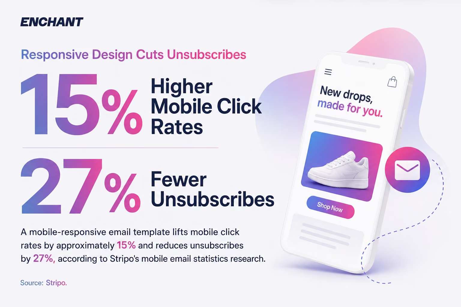
A mobile-responsive email template lifts mobile click rates by approximately 15% and reduces unsubscribes by 27%, according to Stripo's mobile email statistics research. Those are not marginal gains. They are structural improvements that compound across every send.
Mobile-first means you design for a 375–390px viewport first and scale up, not the reverse. It forces discipline. If a design works on mobile, it almost always works on desktop. The opposite is rarely true.
Responsive Email Design Fundamentals
Set your email template maximum width to 600px for desktop with fluid percentage-based widths for mobile. Use inline CSS for core styles (Outlook doesn't reliably pick up external or embedded stylesheets). Set width: 100% on images with a max-width cap so they scale without stretching.
Font sizes matter more on mobile than anywhere else. Body text below 14px is a strain to read on a phone screen. Go to 16px for body copy. Headings should sit at 22–28px. These aren't aesthetic choices, they're usability requirements.
Tap-Friendly CTA Buttons
A CTA button on mobile needs a minimum tap target of 44x44px. Apple's Human Interface Guidelines recommend this, and for good reason: a smaller button is a missed click. Pad your CTA buttons generously, top and bottom, and keep them full-width on mobile so a thumb can't miss them.
Our guide to dark mode email design best practices covers how these same layout principles apply when rendering flips to a dark background, which is increasingly the default for mobile users.
4. Subject Lines and Preheader Text: Your First Design Decision
Subject line and preheader text are the first design decision in every email marketing campaign, because they determine whether the email gets opened at all, before a subscriber sees a single pixel of your design.
Most brands treat the subject line as a copywriting task and the preheader text as an afterthought. That's a mistake on both counts. They are a two-part visual unit in the inbox preview, and they need to be designed together.
Subject Line Best Practices
Keep your subject line under 50 characters for mobile inbox previews. Gmail on Android truncates at around 40 characters. Apple Mail on iPhone shows slightly more. Design for the tightest constraint.
Front-load the most important information. Don't bury your offer or subject matter in the second half of a subject line that gets cut off. If your subject line is "Exclusive offer for our most loyal customers: 20% off today only", a mobile subscriber sees "Exclusive offer for our most loyal cu..." and that's the end of it.
Preheader Text Optimisation
Preheader text sits immediately after the subject line in inbox previews. Aim for 85–100 characters. It should extend the subject line's message, not repeat it. If your subject line says "Your order is on its way", the preheader text shouldn't say "Your order has been dispatched". That's duplication. Use it to add context, create curiosity, or reinforce the CTA.
If you don't set a preheader text explicitly in your email template, most email clients pull the first line of body text. Sometimes that's fine. Often it's "View this email in your browser", which is a wasted impression. Always set it deliberately.
5. Visual Hierarchy: Guiding Readers Through Your Email
Visual hierarchy in email design is the intentional arrangement of elements so that a reader's eye moves through content in the order you choose, from the most important information to the least.
Without visual hierarchy, every element competes for attention equally. The result is an email that feels chaotic, even if each individual component is well-designed. With strong visual hierarchy, a subscriber knows what to look at, what to read, and where to click, in roughly that order.
The Inverted Pyramid Structure
The inverted pyramid is the most reliable structure for email marketing visual hierarchy. Start with a broad, attention-grabbing hero image or headline. Narrow to the key message or offer. Then funnel the reader to a single, clear call-to-action.
This structure works because it mirrors how people actually scan emails. They look at the hero first. If it's relevant, they read the body copy. If the body copy reinforces the hero, they click the CTA. Break that sequence and you lose them at whichever step feels inconsistent.
F-Pattern and Z-Pattern Reading in Emails
Eye tracking research shows that readers scan digital content in F-patterns and Z-patterns. In a single-column email layout, the F-pattern dominates: readers read the first line fully, then scan down the left edge, pausing at bold text, images, and headers.
This has direct implications for email layout. Put your most important claims in the first line of each section. Bold the words you need them to catch on a scan. Don't bury your CTA at the bottom of a long paragraph. At Enchant, our eye tracking research and analysis for email campaigns confirms these patterns hold consistently across brand categories.
Visual hierarchy isn't guesswork. It's testable. And if you haven't tested yours, you probably don't know where your emails are losing people.
6. CTA Design: How to Drive Clicks with Intention
A call-to-action button is the single most important design element in a marketing email, and most email templates get at least one thing wrong about it.
The most common errors: CTAs that blend into the background, CTAs placed so far down the email that mobile readers never reach them, and multiple competing CTAs that create decision paralysis. Our full breakdown of CTA design for email marketing campaigns covers this in detail, but here are the principles that matter most.
Primary vs Secondary CTA
Every email should have one primary call-to-action. One. The primary CTA should appear above the fold (visible before scrolling), use a high-contrast button with clear label text, and sit with white space around it so nothing competes visually.
Secondary CTAs are fine for longer emails, but they need to be visually subordinate. A text link rather than a button, or a smaller button in a secondary colour. If your primary and secondary CTAs look identical, you've given your reader two equally weighted options and they'll probably choose neither.
CTA Button Design Specifics
CTA button copy matters more than most designers acknowledge. "Buy Now" and "Shop the Collection" are both calls-to-action. The second one is lower commitment and will typically outperform the first for cold or warm audiences. Test this in your own email template before assuming one format wins.
Use live text inside your CTA buttons, not text baked into an image. Image-based CTA buttons display as blank boxes when images are blocked, which happens frequently in Outlook and some webmail clients. Live text buttons render in every email client, every time.
Above the Fold Placement
Place your primary call-to-action above the fold wherever the content logic allows it. On mobile, "above the fold" is approximately the first 400–500px of an email. If your hero image runs 600px tall, your CTA is already hidden before the subscriber has scrolled once. Shorter hero images or a CTA embedded in the hero section solve this immediately.
7. Email Accessibility: Building for Every Reader
Email accessibility is both a design quality issue and a legal compliance requirement, with 4,928 US web accessibility lawsuits filed in 2025, a 27% year-over-year increase in federal filings, according to Digital Applied's 2026 web accessibility statistics report.

At least 2.2 billion people globally have near or distance vision impairment, per data from Sight Scotland. That's a large share of any email list. Designing exclusively for readers with perfect vision is both ethically questionable and commercially short-sighted.
Colour Contrast and Text Legibility
WCAG 2.1 AA requires a minimum contrast ratio of 4.5:1 for body text and 3:1 for large text (18px+ or 14px+ bold). Most brand colour palettes weren't built with this in mind. Check every text-on-background combination in your email template using a tool like WebAIM's Contrast Checker before it ships.
The February 2026 WebAIM Million report found that 95.9% of the top one million homepage URLs had detectable WCAG 2 A/AA failures, according to the WebAIM Million accessibility audit. Email is no different. Most teams aren't checking. Check yours.
Alt Text for Every Image
Alt text is not optional. Every image in your email template needs descriptive alt text so screen reader users understand what the image communicates, and so subscribers who have images blocked still receive the message.
Decorative images (spacers, dividers) should have empty alt text (alt="") so screen readers skip them. Informational images (product shots, infographics, promotional banners) need descriptive alt text that conveys the same information the image contains. Our dedicated guide on writing alt text for email marketing campaigns walks through the exact approach for each image type.
Semantic Structure and Screen Readers
Use semantic HTML in your email builds. Heading tags (h1, h2, h3) create navigable structure for screen reader users. Don't use heading tags purely for visual sizing, and don't use paragraph tags to simulate headings. Screen readers announce heading levels, so an email with a logical heading hierarchy is far more navigable for a subscriber using assistive technology.
Live text is always preferable to text embedded in images. Screen readers can't read text inside a JPEG. Your email accessibility depends on it. Your deliverability does too, since a high image-to-text ratio is a spam trigger.
For a full picture of what's coming from a regulatory angle, our European Accessibility Act email marketing guide covers the compliance requirements that are now in effect.
8. Typography and Font Best Practices for Email
Email typography affects readability, brand consistency, and whether your email looks polished or cobbled together, but font selection in email is constrained by email client support in ways that web design is not.
Web fonts (Google Fonts, Adobe Typekit) render in Apple Mail and some webmail clients. They do not render in Outlook, which still defaults to the subscriber's system font when it encounters an unsupported typeface. That means every email template needs a well-constructed font stack with web-safe fallbacks.
Safe Font Stacks for Email
Web-safe fonts that render consistently across email clients include: Arial, Georgia, Helvetica, Tahoma, Times New Roman, Trebuchet MS, and Verdana. These aren't exciting. But they're reliable.
A practical font stack looks like this: font-family: 'Your Brand Font', Arial, Helvetica, sans-serif;. Subscribers on Apple Mail see your brand font. Subscribers on Outlook see Arial. The email still reads cleanly in both.
Font Sizing and Line Height
Minimum body text size in email is 14px. Prefer 16px for primary body copy. Line height should sit at 1.5x to 1.6x the font size for comfortable reading, so 16px text wants 24–26px line height. Tight line spacing is a readability problem, not an aesthetic one.
Limit yourself to two typefaces per email template. One for headings, one for body copy. More than two creates visual noise without adding hierarchy.
9. Images, GIFs, and Visual Content in Email
Image-to-text ratio in email directly affects deliverability, because spam filters treat image-heavy emails with thin text content as a signal of low-quality or evasive sending behaviour.
A rough target: 60% text to 40% images. This isn't a hard rule, but it's a sensible starting point. An email that is one giant image and two lines of text is a deliverability risk. It's also an email accessibility failure, since screen readers can't interpret image content without alt text.
Image Optimisation for Email
Keep individual image file sizes under 100KB where possible. Large images slow load times on mobile connections. Use JPEG for photographs, PNG for graphics with transparency, and always host images externally (on your ESP's CDN or your own) rather than attaching them to the email.
Set explicit width and height attributes on every image in your HTML. Without them, some email clients collapse images to zero dimensions while loading. Your email appears broken until the images load, which for a subscriber on a slow connection might be never.
GIFs and Animated Elements
Animated GIFs work in most major email clients: Apple Mail, Gmail, and most webmail environments. Outlook 2007–2019 renders only the first frame. So if your GIF carries a message in frame two or beyond, Outlook subscribers miss it. Always ensure the first frame of your GIF communicates the core message independently.
GIFs add movement and personality. Used well, they lift engagement. Used carelessly, they slow load times and distract from your CTA. Keep GIF file sizes under 1MB. If your GIF is larger, export it at lower colour depth (128 or 64 colours) before it goes into the email template.
Cinemagraphs and Video Alternatives
Full video doesn't play natively in most email clients. Apple Mail and iOS Mail support HTML5 video via the video tag, but Gmail and Outlook do not. The standard approach: use an animated GIF or a static thumbnail image with a play button overlay, linked to a landing page where the video plays. You get the visual signal of video without the client compatibility headache.
10. Dark Mode Email Design
Dark mode email design is now a standard requirement, not an advanced consideration, because as many as 80% of users switch to dark mode when it's available on their device.
Apple Mail, Gmail (Android), and Samsung Mail all support dark mode rendering. Apple Mail uses "smart invert" and then applies its own colour adjustments. Gmail on Android converts emails that have a light background with no explicit dark mode targeting. The two behave differently, so your email template needs to handle both.
Dark Mode Design Rules
Never use pure black (#000000) or pure white (#FFFFFF) in email design. Use #121212 or #1a1a1a for dark backgrounds and #f5f5f5 or #fafafa for light backgrounds. Pure black and white create harsh contrast and look amateur on modern screens.
Use @media (prefers-color-scheme: dark) in your email's embedded CSS to explicitly target dark mode subscribers. This lets you control colour swaps, image handling, and border colours rather than leaving it to the email client's automatic conversion. Our detailed dark mode email design CSS guide covers the full implementation.
Images in Dark Mode
Images with transparent backgrounds are the biggest dark mode risk. A white logo on a transparent PNG looks fine in light mode. In dark mode with a dark background, it disappears entirely. The fix: use images with solid (non-transparent) backgrounds, or use CSS to add a white background container around transparent images in dark mode via your media query.
Test every email in both light and dark mode before it sends. Litmus and Email on Acid both offer dark mode preview rendering across the main clients. This is not optional for any serious email marketing programme.
11. Email Personalisation, Dynamic Content, and Modular Design
Email personalisation in 2026 means dynamic content blocks driven by behavioural data, lifecycle stage, and segmentation logic. It does not mean a first-name merge tag in the subject line.

First-name personalisation is table stakes. Every ESP offers it. It stopped being meaningful differentiation years ago. Real personalisation pulls from purchase history, browsing behaviour, product category affinity, and zero-party data collected from preference centres and surveys. That's what drives relevant email experiences. And according to Litmus's State of Email 2026 report, advanced AI adopters in email marketing are 75% more likely to achieve ROIs above 45:1. The gap between basic and advanced personalisation is significant.
Dynamic Content Blocks in Email Templates
A modular email template built with dynamic content blocks allows a single send to show different hero images, product recommendations, or body copy to different audience segments, without building multiple separate campaigns.
In Klaviyo, this uses conditional blocks driven by profile properties or segment membership. In HubSpot, it's smart content. In Braze, it's Liquid templating. The syntax differs by ESP; the principle is the same. Build your email template so content slots can be swapped by rule, not by manual duplication.
The Email Design System (EDS)
Every serious brand should have an Email Design System, not a collection of ad-hoc templates that accumulate inconsistencies over time. An EDS is a library of pre-coded, brand-approved content modules, headers, footers, hero blocks, product tiles, CTA sections, text blocks, and dividers, that can be assembled into any campaign without rebuilding from scratch each time.
We've built Email Design Systems for clients including the University of Portsmouth in Salesforce Marketing Cloud. The production efficiency gain is substantial, but the bigger benefit is brand consistency. Every email that leaves a client's account looks like it came from the same brand, regardless of which team member built it or which campaign it supports.
12. A/B Testing Email Design Elements
A/B testing email design is the only way to move from opinion to evidence when making decisions about subject lines, hero images, CTA button copy, layout, and send timing.
Most email marketing teams test subject lines. Fewer test CTA placement, hero image choice, email length, or preheader text. All of these affect performance. Subject line testing tells you what gets opened. Design testing tells you what gets clicked. You need both.
What to Test and When
Test one variable at a time. If you change the subject line and the hero image simultaneously, you can't attribute any performance difference to either change. Split your list so each variant receives enough sends to reach statistical significance before you call a winner. A sample of 1,000 per variant is a reasonable floor for most lists.
Priority order for email design A/B testing:
- Subject line and preheader text — highest leverage, affects open rate directly
- CTA button copy and colour — affects click-through rate, easy to isolate
- CTA placement — above the fold vs mid-email vs footer
- Hero image vs no hero image — particularly relevant for mobile
- Email length — short focused email vs longer content-rich format
- Single-column vs multi-column layout — especially for product-led campaigns
Reading Your Results Correctly
Given that Apple's Mail Privacy Protection inflates open rate data, open rate tests need careful interpretation. If 58% of your reported opens are Apple proxy pre-loads rather than human opens, your open rate lift from a subject line test may not reflect actual human behaviour as directly as it once did. Weight click-through rate and conversion rate more heavily in your analysis. These metrics are not affected by MPP.
Don't test for the sake of it. Every test should have a specific hypothesis: "We believe a low-commitment CTA label ('See the Collection' vs 'Buy Now') will increase click-through rate for this cold segment." Test that. Document the outcome. Build a body of evidence about what works for your specific audience, your specific brand, and your specific email marketing programme.
Putting Email Design Best Practices Into Practice
Good email design is not a one-time project. It's a system. Build your email template on a mobile-first, single-column foundation. Apply visual hierarchy deliberately using the inverted pyramid. Make every CTA a live-text button with adequate tap targets. Write preheader text that extends the subject line rather than repeating it. Check colour contrast for email accessibility compliance. Add alt text to every image. Test in dark mode before every send.
The brands that treat email design as a system, with an Email Design System, modular content blocks, and a consistent A/B testing programme, consistently outperform those that treat each campaign as a standalone creative project. That's not an opinion. It's what we see across clients in 14 industries.
If you want an expert eye on your current email template and design system, our email marketing design and templates service covers everything from a full design audit to building a bespoke EDS from scratch. Or if you'd prefer to start with a conversation about where your email marketing programme stands right now, speak to our team.