Dark Mode Email Design: Best Practices & CSS Guide 2026
Dark mode email design isn't optional anymore. Applications automatically switch to dark mode based on user preference, and your emails need to look just as professional in dark backgrounds as they do in light ones.
The challenge? Email clients handle dark mode differently.
Some force full color inversion. Others let you control the experience. Your carefully crafted brand colors might turn muddy, your logo could disappear into a black void, and your carefully balanced contrast ratios might become unreadable.
This guide shows you exactly how to design emails that work beautifully in both light and dark modes. You'll learn which email clients support dark mode, how to optimize your images and colors, and the specific CSS techniques that give you control over the dark mode experience.
By the end, you'll know how to create emails that maintain your brand identity and readability no matter which mode your subscribers prefer.
What Is Dark Mode and Why Does It Matter for Email Design?
Dark mode flips your interface from light backgrounds with dark text to dark backgrounds with light text. Users love it for three key reasons.
First, dark mode reduces eye strain, letting users browse comfortably in low-light conditions. Your subscribers reading emails late at night or in dimly lit environments get a better experience.

Second, dark mode extends battery life on OLED devices by reducing screen brightness. Since OLED screens light individual pixels, displaying black pixels uses almost no power. Your mobile subscribers get longer battery life when reading your dark mode emails.

Third, dark mode looks modern. Dark mode enhances design elements and gives websites a contemporary aesthetic. This preference extends to email design, where users expect the same polished dark mode experience they get from their favorite apps.
The adoption numbers tell the story. Many websites offer both light and dark versions, allowing users to toggle between them. Email clients followed this trend, implementing their own dark mode features.
Here's what makes email dark mode tricky. Your email doesn't control whether it displays in dark mode. The email client or device does. Some clients invert your colors automatically. Others leave your design alone. Still others offer hybrid approaches that partially modify your colors.
This matters for three specific email design challenges. Your logo might disappear against dark backgrounds if it uses dark colors. Your carefully chosen brand colors might look completely different after automatic inversion. Your text contrast might drop below readable levels if the client changes backgrounds but not text colors.
Understanding how email clients handle dark mode helps you design emails that work everywhere.
How Different Email Clients Handle Dark Mode
Email clients fall into three categories based on how they process your email design in dark mode.
Full Color Inversion Email Clients
Some email clients invert every color in your email. They take your white background and make it black. They change your black text to white. They flip your brand colors to their opposites on the color wheel.
Gmail on certain devices and Outlook for iOS use this approach. Your carefully designed email becomes a photographic negative. Light blues become dark oranges. Your red call-to-action button might turn cyan.
This creates readability problems. If you designed with perfect contrast in light mode, full inversion might create jarring color combinations. Your subtle gray backgrounds become harsh bright grays. Your elegant dark navy header becomes an electric light blue.
The fix requires using the CSS media query prefers-color-scheme: dark to override these automatic inversions with your own dark mode styles.
Partial Inversion Email Clients
Other email clients take a hybrid approach. They change background colors but leave your images and some design elements alone. Or they invert backgrounds and text but preserve your brand colors.
Apple Mail and Outlook 2019 for Mac often use this method. They try to make your email readable in dark mode without completely destroying your design.
This sounds better than full inversion. But it creates new problems. Your dark gray text might stay dark gray when the background turns black. Your white logo on a white background might become a white logo on a black background, looking fine. But your navy blue sidebar might not invert at all, creating a strange patchwork effect.
Testing becomes critical with partial inversion clients. You need to preview exactly which elements get inverted and which stay the same.
No Change Email Clients
Some email clients support dark mode in their interface but leave your email design completely alone. Your email displays exactly as you coded it, regardless of whether the user has dark mode enabled.
Gmail on web often works this way. The interface around your email turns dark, but your email stays in light mode with its original colors.
This approach is safe for designers. Your email looks identical for all users. But it creates a poor user experience. The bright white email glares out from the dark interface, eliminating all the benefits users expect from dark mode.
Now that you understand the three inversion types, you need to know which email clients use which approach.
Dark Mode Email Client Support Chart
Different email clients handle dark mode in different ways. This chart shows you exactly what to expect from each major email client so you can test strategically.
Email ClientDark Mode SupportInversion TypeCSS Override SupportApple Mail (iOS)YesPartial inversionYes with prefers-color-schemeApple Mail (macOS)YesPartial inversionYes with prefers-color-schemeGmail (iOS app)YesFull inversionLimitedGmail (Android app)YesFull inversionLimitedGmail (Web)NoNo changeN/AOutlook (iOS)YesFull inversionLimitedOutlook (Android)YesPartial inversionSome supportOutlook 2019 (Mac)YesPartial inversionYes with prefers-color-schemeOutlook 2021 (Windows)YesPartial inversionSome supportWindows MailYesFull inversionNo
The key takeaway? Apple Mail gives you the most control. Gmail and Outlook mobile apps will aggressively invert your colors. Desktop Outlook versions vary widely.
More users are opening emails on mobile devices and in dark mode, making mobile email clients your top testing priority. Focus your dark mode optimization efforts on iOS and Android Gmail and Apple Mail first.
This chart should guide your design decisions. If most of your subscribers use Apple Mail, you can implement sophisticated dark mode overrides using CSS. If your audience mainly uses Gmail mobile apps, you need simpler designs that survive full color inversion.
Check your email analytics to see which clients your subscribers actually use. Then prioritize testing for those specific environments.
Optimizing Your Email Design for Dark Mode
Start with designs that work before any dark mode modifications happen. This foundation approach saves you from fighting aggressive color inversions.
Design with Minimal Backgrounds
Use transparent or minimal background colors in your email design. When email clients invert backgrounds, simple designs adapt better than complex ones.
Avoid large colored background blocks. They might invert into unexpected colors. Instead, use borders, subtle shadows, or whitespace to create visual separation.
Keep your layout clean. Complex background patterns with multiple colors create chaos when inverted. A simple white background with strategic colored accents survives dark mode better than elaborate background designs.
Use System Fonts
Stick with web-safe system fonts instead of custom web fonts. System fonts render consistently across email clients and maintain readability in dark mode.
Arial, Helvetica, Georgia, and Times New Roman work everywhere. They also maintain proper weight and spacing when email clients modify colors around them.
Custom fonts sometimes render poorly in dark mode. The email client might not invert them properly, creating contrast problems. System fonts avoid these technical issues.
Design Mobile-First
Most dark mode email opens happen on mobile devices. Design for small screens first, then enhance for desktop.
Use single-column layouts that work on any screen size. They also adapt better to dark mode since there are fewer competing visual elements.
Test your mobile dark mode experience obsessively. Open your emails on actual iOS and Android devices in dark mode. Email previews don't always show exactly what subscribers see.
Maintain Visual Hierarchy
Your email hierarchy should stay clear in both light and dark modes. Use font sizes, weights, and spacing to create structure, not just color.
If your headings rely only on color to stand out, they might disappear in dark mode. Make them larger or bolder so they remain distinct even when colors change.
Test your hierarchy by viewing your email in grayscale. If the structure still makes sense without color, it'll survive dark mode.
These foundation principles prepare your email for the specific color and image optimizations that come next.
Color Strategies for Dark Mode Emails
Colors behave unpredictably in dark mode. These strategies give you control over how your email looks when backgrounds flip from light to dark.
Avoid Pure Black and Pure White
Never use true black (#000000) or pure white (#FFFFFF) in your email design. They create harsh contrast in dark mode that strains eyes.

Use dark gray (#121212 or #1a1a1a) instead of black. Use off-white (#f5f5f5 or #fafafa) instead of pure white. These softer alternatives reduce eye strain while maintaining readability.
When email clients invert your colors, these near-blacks and near-whites produce more comfortable results than extreme values. The difference seems small, but it significantly improves the reading experience.
Test Your Brand Colors
Your brand colors might look terrible when inverted. Test them before committing to a design.
Open a color wheel and find the opposite of each brand color. That's approximately what subscribers will see after full inversion. If the inverted version clashes or becomes unreadable, you need a backup plan.
Brands customize dark palettes to match their identity instead of accepting automatic inversions. Create a dark mode version of your color palette that maintains your brand feel while working on dark backgrounds.
Choose darker, less saturated versions of your brand colors for dark mode. Bright colors look garish on dark backgrounds. Muted versions of the same hues work better.
Maintain Contrast Ratios
Text needs sufficient contrast against backgrounds to remain readable. Aim for at least 4.5:1 contrast ratio for body text and 3:1 for large text.
Use online contrast checkers to verify your color combinations meet these standards in both light and dark modes. Don't assume that good light mode contrast automatically works in dark mode.
Pay special attention to gray text. Light gray on white provides decent contrast. But when inverted to dark gray on black, the same contrast ratio might fall below readable levels. Test every text color in both modes.
Use Transparent Backgrounds for Inline Elements
Set transparent backgrounds for text blocks and content areas when possible. This lets the email client's dark mode background show through naturally.
Define background colors only where absolutely necessary for design hierarchy. The fewer background colors you specify, the fewer elements can invert poorly.
This approach works especially well for text-heavy emails. Let the email client handle the background color while you focus on optimizing text and images.
Speaking of images, they require special attention in dark mode email design.
Image and Logo Optimization for Dark Mode
Images cause the biggest dark mode problems. Your logo might disappear. Your product photos might look wrong. These techniques keep your images looking professional in both modes.
Use Transparent PNG Images
Save your logos and icons as transparent PNGs instead of JPEGs with white backgrounds. Transparent backgrounds adapt automatically when email clients change the surrounding background color.
A logo with a white background becomes invisible when that white background turns black in dark mode. A transparent logo works on any background color.
Export your logo in PNG-24 format with transparency enabled. Make sure the edges are clean with no white halos or artifacts that will show up on dark backgrounds.
Add Borders or Glows to Transparent Images
Transparent logos still have a problem. If your logo uses dark colors, it disappears on dark backgrounds even with transparency.
Add a thin white border or subtle glow effect to dark logos. This creates separation from dark backgrounds while remaining invisible on light backgrounds.
Use a 1-2 pixel white stroke around dark logo elements. Or add a soft drop shadow with white color and low opacity. This ensures visibility regardless of background color.
Provide Alternative Image Versions
For critical images like logos, provide separate light mode and dark mode versions. Use CSS to show the appropriate version based on the user's preference.
Create two versions of your logo. One optimized for light backgrounds with dark colors. Another optimized for dark backgrounds with light colors or white outlines.
Then use the prefers-color-scheme media query to display the correct version. This gives you complete control over how your logo appears in each mode.
Test Product Images on Dark Backgrounds
Product photos taken on white backgrounds often have white or light gray edges. These create ugly halos in dark mode.
Remove backgrounds from product images completely. Use transparent PNGs with clean edges. Or photograph products on neutral mid-gray backgrounds that work in both light and dark modes.
Test every product image by placing it on a black background. Any imperfections in background removal or edge quality will show up immediately.
Consider Image Opacity Adjustments
Some email clients automatically dim images in dark mode to reduce their brightness. This can make colorful images look washed out.
Use CSS to control image brightness in dark mode. Set a slightly higher brightness value for images when dark mode is detected. This compensates for automatic dimming.
Test this carefully. Too much brightness adjustment makes images look overexposed. Start with subtle changes like 105-110% brightness and adjust based on how images actually render.
Now that your images work in dark mode, use CSS to fine-tune the entire email experience.
Dark Mode CSS Targeting Methods
CSS gives you direct control over how your email appears in dark mode. These methods let you override automatic color inversions with your own carefully chosen styles.
The Prefers-Color-Scheme Media Query
The prefers-color-scheme media query detects whether the user has dark mode enabled. Then it applies your custom dark mode styles.
Add this code to your email's CSS:
@media (prefers-color-scheme: dark) {
  .email-container {
    background-color: #1a1a1a !important;
    color: #f5f5f5 !important;
  }

  .header {
    background-color: #2d2d2d !important;
  }

  .button {
    background-color: #0066cc !important;
    color: #ffffff !important;
  }
}
This overrides automatic inversions with your specified colors. Apple Mail and other modern email clients support this media query. Gmail mobile apps have limited support, but it's still worth implementing.
Use !important declarations to ensure your dark mode styles override email client defaults. Email clients use aggressive specificity, so you need !important to win the cascade.
Target Specific Email Client Dark Mode Features
Some email clients add special attributes to HTML elements in dark mode. You can target these attributes with CSS selectors.
Outlook adds the data-ogsc attribute to elements when applying dark mode. Target it like this:
[data-ogsc] .email-container {
  background-color: #1a1a1a !important;
}
Apple Mail doesn't add special attributes but fully supports prefers-color-scheme. Focus your CSS on that media query for maximum compatibility.
Implement Color-Scheme Meta Tag
Add the color-scheme meta tag to tell email clients you've optimized for dark mode. This prevents some aggressive automatic inversions.
<meta name="color-scheme" content="light dark">
<meta name="supported-color-schemes" content="light dark">
Place these tags in your email's head section. They signal that your email supports both light and dark modes, encouraging email clients to use your styles instead of forcing inversions.
Control Individual Element Colors
Don't just set global colors. Target specific elements that need special treatment in dark mode.
@media (prefers-color-scheme: dark) {
  /* Background elements */
  .hero-section {
    background-color: #0d0d0d !important;
  }

  /* Text colors */
  h1, h2, h3 {
    color: #ffffff !important;
  }

  p {
    color: #e0e0e0 !important;
  }

  /* Links */
  a {
    color: #4da6ff !important;
  }

  /* Buttons */
  .cta-button {
    background-color: #0066cc !important;
    border-color: #0066cc !important;
    color: #ffffff !important;
  }
}
This granular control lets you maintain brand consistency and readability in dark mode. Adjust each element type individually for optimal results.
After implementing these CSS strategies, thorough testing ensures your emails actually work as intended.
Testing Your Emails in Dark Mode
Design and code mean nothing until you verify your emails work in actual email clients. Testing catches problems before subscribers see them.
Test on Real Devices
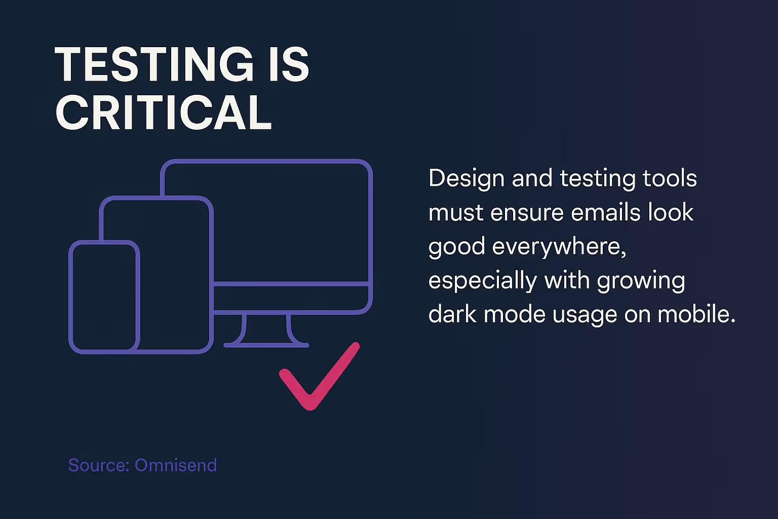
Design and testing tools must ensure emails look good everywhere, especially since dark mode usage keeps growing on mobile devices.

Send test emails to yourself on iOS and Android devices. Enable dark mode in system settings, then open your email in the native mail app and Gmail app.
Screenshots from desktop preview tools don't show the full picture. Actual devices reveal rendering differences that preview tools miss.
Test on both tablet and phone screen sizes. Dark mode can render differently on various form factors, especially for complex layouts.
Use Email Testing Services
Services like Litmus and Email on Acid show how your email renders across dozens of email clients in both light and dark modes.
These tools capture screenshots of your email in every major email client. You see exactly what subscribers see without needing dozens of devices.
Look for unexpected color inversions, disappeared logos, and unreadable text. Compare light and dark mode versions side by side to spot issues.
Run tests every time you change your email template. Even small CSS tweaks can cause unexpected dark mode problems.
Check Your Dark Mode Checklist
Before sending any email to your full list, verify these dark mode elements:
- Logo remains visible on both light and dark backgrounds
- All text has sufficient contrast in both modes
- Brand colors look acceptable in dark mode
- Images don't have white halos or artifacts
- Buttons remain clickable and visible
- Background colors create proper hierarchy
- Links are clearly distinguishable from body text
Save this checklist and use it for every email campaign. Consistent checking prevents dark mode disasters.
Monitor Engagement Metrics by Email Client
Track how subscribers using different email clients engage with your emails. Low engagement from Apple Mail users might indicate dark mode rendering problems.
Look at open rates, click rates, and conversion rates segmented by email client. Unusually low performance in specific clients often signals technical issues worth investigating.
Test your emails thoroughly in any client showing below-average performance. Dark mode problems frequently show up as engagement drops in specific clients.
Collect Subscriber Feedback
Ask subscribers how your emails look. Add a simple feedback link in your email footer asking about display issues.
Most subscribers won't respond, but the few who do often reveal critical problems. Someone seeing a completely black email or missing logos will tell you.
Take subscriber feedback seriously. One person reporting a problem likely means hundreds seeing the same issue silently.
Key Questions About Dark Mode Email Design
How do I design emails for dark mode?
Use transparent PNG images with borders or glows to prevent logos from disappearing. Avoid true black backgrounds by using dark gray (#121212) instead. Test emails in dark mode preview tools before sending. Ensure proper contrast between text and backgrounds to maintain readability across different email clients.
What percentage of people use dark mode for emails?
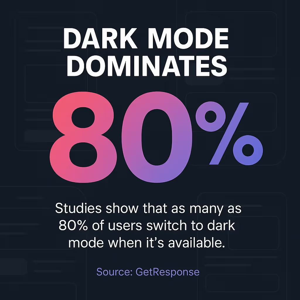
Studies show that as many as 80% of users switch to dark mode when it's available. This high adoption rate makes dark mode optimization essential rather than optional for email marketers.

Which email clients have the best dark mode support?
Apple Mail on iOS and macOS offers the most robust dark mode support with full CSS override capabilities. These clients honor the prefers-color-scheme media query and give designers significant control over the dark mode appearance.

Making Dark Mode Work for Your Email Strategy
Dark mode email design requires planning, testing, and iteration. But the payoff is worth it.
Start by auditing your current email templates. Open them in dark mode on your phone. Identify obvious problems like disappeared logos or unreadable text.
Fix the worst issues first. Convert logo files to transparent PNGs. Replace pure black and white colors with softer alternatives. Add basic dark mode CSS targeting.
Then test everything. Send yourself emails on multiple devices with dark mode enabled. Use testing services to see how your emails render across different email clients.
Document what works. Email design trends for 2026 include dark mode as a standard consideration, not an afterthought.
Remember that site accessibility is crucial when incorporating dark mode, ensuring text readability and straightforward navigation. This applies to emails just as much as websites.
Your subscribers will notice the difference. Better readability means longer engagement. Proper dark mode support shows you respect their preferences.
Need help implementing these dark mode strategies in your email campaigns? Our email marketing design services include dark mode optimization as standard practice.
Start optimizing your next email campaign for dark mode today. Your subscribers' eyes will thank you.


.svg)
.avif)


