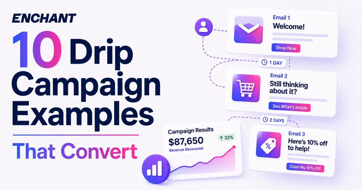
.svg)
How marketers can utilise eye tracking for email marketing

Eye tracking for email isn't a new concept, but it's hugely underutilised by marketers. In this guide, we'll explain what it is, how it works and how you can get Enchant to eye track your designs for free. Let's jump in!
So, what even is eye tracking? It's a type of Artificial Intelligence (AI), that's been around for over 15 years and was introduced by three of worlds leading neuroscientists, who specialised in the outputs of computational neuroscience. It's often applied to app design, websites and even retail store layout planning, but it's hardly ever used in email marketing. This is where marketers are missing out.
Eye tracking with email, simulates human attention and perception of an email creative. Its accuracy is almost perfect (99%) and enables marketers to instantly gain insight about your email design and begin to make informed decisions about what needs to change.
Eye tracking for email marketing has seldomly been used, but it's something that's a standard in other channels. We're seeking to change that.
So what exactly does it do?
Eye tracking allows marketers and designers to identify where subscribers are focusing their attention, as well as other things such as:
- Perception (what subscribers see/don't see in the first three seconds)
- Attention (what subscribers see/don't see overall)
- Clarity (how clear is the email?)
- Cognitive load (how hard are you making your subscribers work, to read the email?)
- Excitingness (how exciting is the email?)
This allows brands to learn quickly and apply the feedback generated into email design. Brands can be confident in providing statistically significant information about elements in an email and see the impact of those changes in a matter of minutes.
Brands are increasingly waking up to the opportunity that neuroscience brings to performance in email and it's something we've been focussing on this year. We have utilised this method with over 100 brands and seen astonishing results, usually by making very simple tweaks to an email design.
Here are some of the questions we ask when we analyse our clients email designs:
- What will the subscriber see in the email first?
- Will elements in this email cause confusion?
- Will the subscriber find the layout stimulating?
- Will they see the call to action?
Using eye tracking software for email is so important because it rapidly builds certainty into the effectiveness of a design. It provides valuable insights into how recipients interact with and visually engage with email content and allows marketers and designers to understand where users focus their attention, how they navigate through emails, and which elements they find most engaging.
Let's have a look at a few case studies....
Study 1: FIFA Women's World Cup
Creative:

Analysis:
For this email, the perception map offers the most useful insights - this shows us what's seen in the first three seconds.
Notice how much engagement there is with faces here - this is common and you should be mindful with image selection - people can get unconsciously snagged on faces, stealing attention. It's not too bad here, as people do see the first headline. But here's the important bit: they do not see the second "welcome" headline and they don't read the text.
We also noticed a high cognitive demand score with this email. That means that it's too complex for email subscribers to read with ease = they won't read it and they are less likely to click.
Our advice is:
- Reconsider the primary image and if possible, lead with one player's face
- Drop the Welcome headline
- Cut the copy to three lines of text
- Remove the dark background colour as this is contributing to a high cognitive load
These changes will see an increase in engagement with the content of the email.
Study 2: MATCHES Fashion
Creative:

Analysis:
We can see that the attention of the header and primary block is diffused here, but subscribers do see the main content. The key insight here, is the structure of this email is preventing openers from seeing the information in the order that they expect/want it. This is proven in the engagement being on the leading headline and proposition, but subscribers have to consume a lot of information before arriving there.
It's also worth noting that there is likely a lot of unconscious engagement with the image here. Unconscious engagement is where content is likely seen but not directly looked at. This can be a good thing, but it's not so good if you want people to see that content. Here, the image is broadly passable - it's not essential in communicating newness / the message here, so really it's decorative and somewhat getting in the way of the core message.
Our advice is:
- Re-structure the email so that the information on newness comes before the image
- Simplify the header and navigation so that it's more selective around the most important messages and content
- Redesign the CTA and test a variety of designs, so that engagement improves on the CTA - this will also need to be proven through split testing these buttons in live campaigns
Study 3:
Creative:

Analysis:
On face value, this is a lovely email and there are so many positives - great typography, strong buttons, great imagery and aesthetically it's very strong. From a performance perspective, the primary block doesn't get the attention we want. From a branding perspective, it's a great piece of work. From a performance marketing perspective, we need to look deeper. Let's see how the proposition block and what follows, performs:

I was hoping to see more engagement on the copy and CTAs, but you can see this is gazed over instead of being the focus of engagement. This email is a great case for an old-fashioned split test - this design versus a very different layout
Our advice is:
- Split test a new design that follows the following counsel
- Cut the intro image - either entirely or have it as a secondary image below the primary content
- Show the categories in lists, without images - this will look a little dull, but it's likely to get the most clicks and will likely perform very well in eye tracking
Want 3x of your brands' emails eye tracked?
Enchant will eye-track three of your emails for free, with a walk-through video sharing our insights and advice, based on our findings. All you need to do is submit your creative here and we'll have them back to you in no time.


.avif)
.webp)