.svg)
How to Build a Monthly Email Marketing Report Execs Actually Read
.avif)
An email marketing report is a structured document that tracks key performance indicators across your email campaigns, including open rate, click-through rate, conversion rate, bounce rate, unsubscribe rate, and revenue attribution, giving stakeholders a clear view of channel performance against business goals. Email marketing generates an average ROI of $36–$42 for every $1 spent according to Litmus's ROI analysis, making it the highest-returning digital marketing channel you run. Yet one in five email marketers struggles to measure or prove that ROI, per the Validity State of Email 2025 report. The gap is not the channel. It is the report.

Most email marketing reports are built for the person writing them, not the person reading them. Spreadsheets full of open rates, a screenshot from Klaviyo, maybe a line about unsubscribes. Fine for a weekly team standup. Useless for a CMO who needs to know whether email is pulling its weight in the revenue mix. This guide walks you through exactly what to include, how to structure it, and which tools make the whole thing repeatable every month.
What Is an Email Marketing Report?
An email marketing report is a periodic summary of email campaign performance, measuring the key performance indicators that connect send activity to business outcomes. It covers deliverability, engagement, conversion, and revenue data across both broadcast campaigns and automated flows, presented in a format that allows leadership to act on the findings.
The distinction between a report and a data export is important. A data export tells you what happened. An email marketing report tells you what it means and what to do next.
There are three main report types most teams run in parallel:
- Campaign-level reports — post-send analysis for individual email campaigns, covering open rate, click-through rate, and immediate conversion data.
- Monthly email marketing reports — the executive-facing summary across all sends in the period, including aggregate email performance, list health, and revenue contribution.
- Automation reports — performance tracking for triggered flows (welcome series, abandoned cart, post-purchase), which often tell a very different story from broadcast email marketing metrics.
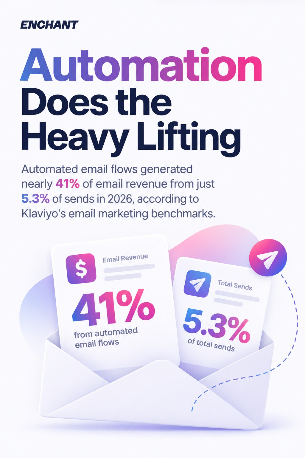
That last category is worth flagging early. Automated email flows generated nearly 41% of email revenue from just 5.3% of sends in 2026, according to Klaviyo's email marketing benchmarks. If your email marketing report only covers campaigns, you are missing the most efficient part of the programme.
Why Email Marketing Reporting Matters for Revenue Accountability
Email marketing reporting has shifted from a channel hygiene exercise to a revenue accountability function, with multi-channel attribution and marketing qualified leads (MQLs) from email jumping 22% year-over-year as teams move toward tying email performance to commercial outcomes, per Litmus's email marketing trends analysis.
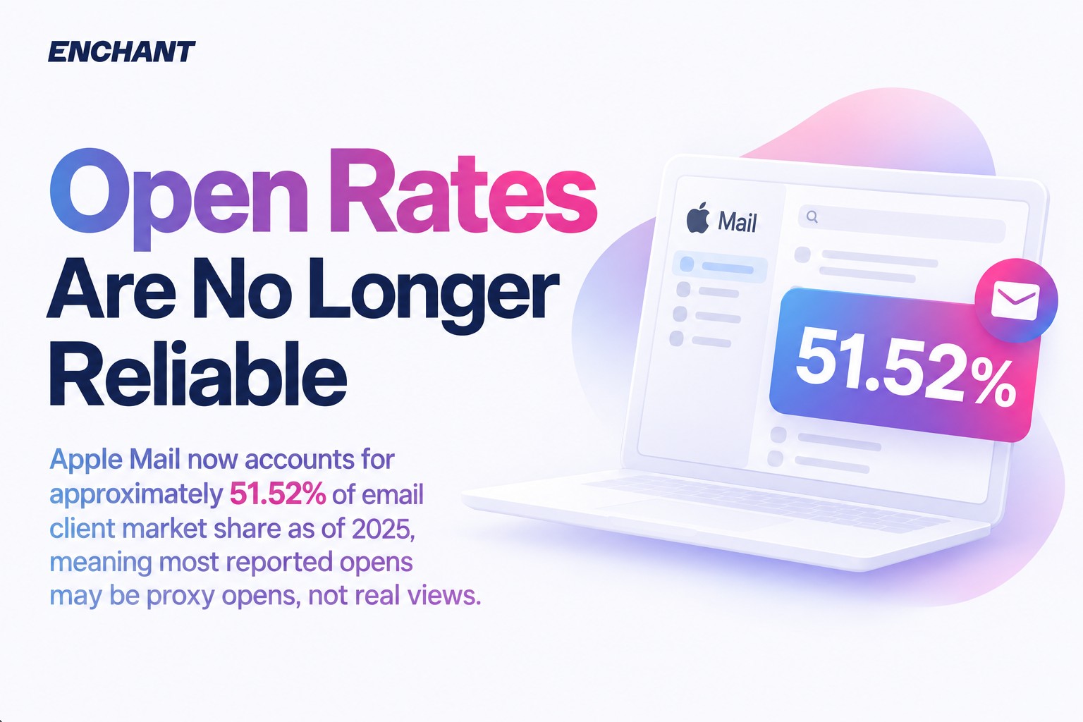
That shift creates a problem for teams still reporting on vanity metrics. Open rates, particularly since Apple Mail Privacy Protection, are unreliable for a large proportion of lists. Apple Mail now accounts for approximately 51.52% of email client market share as of 2025, according to Designmodo's email marketing statistics. That means for many brands, the majority of reported "opens" are proxy opens recorded by Apple's mail prefetch, not actual human eyeballs.
Reporting on inflated open rates as a headline KPI is not just misleading. It actively erodes credibility with senior stakeholders who will eventually notice the disconnect between strong open rates and flat revenue numbers.
The Siloed Reporting Problem
Siloed departments make it harder to tell a cohesive revenue story through email metrics, as Litmus identified in their 2025 State of Email crossover recap. When your ESP data lives separately from your ecommerce platform, your CRM, and your web analytics, nobody can draw a straight line from email send to revenue. That is exactly the line executives want to see.
The fix is not a fancier report template. It is connecting your data sources before you build the report. We will cover that in the dashboard section below.
What Good Email Marketing Reporting Proves
A well-built email marketing report does four things: it confirms the channel is reaching inboxes (deliverability), it shows subscribers are engaging (open rate, click-through rate), it demonstrates that engagement converts to revenue (conversion rate, ROI), and it shows the list is healthy and growing (list growth, unsubscribe rate, bounce rate). Any report missing one of these four areas is incomplete.
You can see how these connect to broader email marketing trends and results benchmarks when you are setting expectations with leadership.
Core Email Marketing Metrics to Include in Every Report
A complete email marketing report tracks eight core email marketing metrics across four categories: deliverability, engagement, conversion, and list health, and each metric requires a formula and a benchmark to be actionable.
Most teams over-report on engagement and under-report on deliverability. That is backwards. If your emails are not reaching inboxes, every other metric is fiction.
Deliverability Metrics
Bounce rate measures the percentage of emails that did not reach the recipient's inbox. Hard bounces (permanent failures, invalid addresses) should be removed immediately. Soft bounces (temporary failures) warrant monitoring. A bounce rate above 2% is a signal to audit your list hygiene.
Formula: (Bounced emails / Emails sent) x 100
Spam complaint rate is the percentage of recipients who mark your email as spam. Keep this below 0.08% to protect sender reputation. Google and Yahoo's 2024 sender requirements made this threshold non-negotiable for bulk senders. A rising spam complaint rate is a deliverability emergency, not a footnote.
Formula: (Spam complaints / Emails delivered) x 100
Engagement Metrics
Open rate remains in most email marketing reports, but treat it as a directional signal rather than a precise measurement post-Apple MPP. It is still useful for trend analysis within your own data, particularly for identifying subject line performance and send-time optimisation. Use it comparatively, not absolutely.
Formula: (Unique opens / Emails delivered) x 100
Click-through rate (CTR) is the more reliable engagement benchmark. The top KPI for marketing emails is click-through rate, cited by 29% of marketing professionals according to eMarketer's email marketing personalisation trends research. Average CTR across 2025 campaigns ranged from 2.09% to 6.21% per MailerLite's industry benchmark data. Where your campaigns sit in that range, and why, is the conversation worth having with leadership.

Formula: (Unique clicks / Emails delivered) x 100
Click-to-open rate (CTOR) measures click-through rate among openers only, filtering out the noise from proxy opens. It tells you whether your email content is compelling to the people who actually saw it.
Formula: (Unique clicks / Unique opens) x 100
Conversion Metrics
Conversion rate tracks the percentage of recipients who completed a desired action after clicking, whether that is a purchase, a sign-up, or a form submission. Email click-to-conversion rates grew 27.6% in 2024 per Omnisend's email marketing statistics. That is the number that belongs in your executive summary.
Formula: (Conversions / Emails delivered) x 100
Revenue per email (RPE) is the single most exec-friendly metric in the report. It translates email performance into a number the CFO understands immediately.
Formula: Total revenue attributed to email / Number of emails delivered
List Health Metrics
Unsubscribe rate should be tracked per campaign and as a monthly trend. A spike in unsubscribe rate on a specific campaign tells you something about that send. A rising monthly trend tells you something about the programme overall. Keep individual campaign unsubscribe rates below 0.5%.
Formula: (Unsubscribes / Emails delivered) x 100
List growth rate tracks net subscriber acquisition after accounting for unsubscribes, bounces, and spam complaints. A programme that is acquiring new subscribers but losing existing ones at the same rate is not growing, it is running to stand still.
Formula: ((New subscribers - Unsubscribes - Bounces) / Total list size) x 100
Email Marketing Benchmarks by Industry
Email marketing benchmarks vary significantly by sector, and comparing your email performance against cross-industry averages produces misleading conclusions; a 2% CTR in B2B SaaS is strong, while the same figure in ecommerce promotional sends is worth investigating.
The honest answer is that the most useful benchmark is your own historical data. Your prior month. Your prior quarter. The same campaign type, one year ago. Industry averages give you a starting point; your own trajectory tells you whether you are improving.
With that said, here are the reference ranges worth including in your email marketing report for context:
One benchmark worth calling out for any ecommerce brand: automated emails represent only around 2% of email sends but generated 30% of email-attributed revenue in 2025 according to Omnisend's 2026 ecommerce marketing report. If your email marketing report is not breaking out automation performance separately from broadcast campaigns, you are burying your best numbers.
See how broader 2025 email marketing predictions from industry experts align with these benchmark movements when presenting performance context to leadership.
How to Create an Email Marketing Report Step by Step
Creating a monthly email marketing report that executives will actually read requires six steps: define your reporting goals, choose your key performance indicators, pull and clean your data, calculate your metrics, add context and recommendations, and distribute in the right format.
This is not a data pull. It is a narrative with numbers attached.
Step 1: Define What the Report Needs to Answer
Before opening your ESP, write down the three questions your CMO or MD would ask if they were in the room. Usually it is some version of: did email grow revenue this month, is the list healthy, and are we getting better? Your email marketing report structure should answer those three questions in the first page.
Step 2: Choose Your KPIs and Stick to Them
Pick eight to twelve key performance indicators maximum and report on the same ones every month. Consistency is what makes the report useful over time. Changing metrics every report makes trend analysis impossible and makes it look like you are hiding something.
Your core KPIs should span all four categories: deliverability (bounce rate, spam complaint rate), engagement (click-through rate, CTOR, open rate as directional), conversion (conversion rate, revenue per email), and list health (unsubscribe rate, list growth rate).
Step 3: Pull and Reconcile Your Data
Export your campaign data from your ESP (Klaviyo, HubSpot, Braze, Mailchimp, or whichever platform you use). Cross-reference against your ecommerce platform or CRM for revenue attribution. Check that the attribution window is consistent month to month. A 1-day attribution window and a 5-day attribution window will produce very different conversion rate figures for the same campaign.
This reconciliation step is where most teams lose time. Getting your ESP connected directly to your reporting dashboard (covered in the next section) removes this manual step entirely.
Step 4: Calculate Metrics and Flag Anomalies
Run your formulas. Then immediately flag anything that moved more than 15% in either direction compared to the prior month. A spike in unsubscribe rate, a drop in click-through rate, or a sudden improvement in conversion rate all need a one-sentence explanation in the report. Executives do not want to guess why a number changed.
Step 5: Add Interpretation and Recommendations
This is the section most email marketing reports are missing entirely. Do not just present the numbers. Tell the reader what they mean and what you are doing about them. One paragraph per key finding. A recommendation, not just an observation.
Companies achieving 36:1 to 50:1 ROI dedicate 25–50% of their marketing team to email operations per Validity's State of Email 2025 report. That level of resource commitment requires exactly this kind of reporting to justify it.
Step 6: Format for the Audience
Your email marketing report has two audiences. The executive summary (one page maximum) is for senior stakeholders who need the headline numbers and the so-what. The appendix is for your email team who need the full campaign-level breakdown. Build both into the same document.
PDF for distribution, editable Google Slides or PowerPoint as the working template. Consistency in format month to month matters as much as consistency in metrics.
How to Build an Email Marketing Reporting Dashboard
An email marketing reporting dashboard connects your ESP data, ecommerce or CRM data, and web analytics into a single live view of email performance, replacing the manual monthly data pull with an always-current snapshot that any stakeholder can access.
The dashboard is not a replacement for the monthly email marketing report. It is the data layer underneath it. Your report interprets what the dashboard shows.
Choosing the Right Dashboard Tool
For most teams, the choice is between three approaches:
- Native ESP dashboards (Klaviyo, HubSpot, Braze, Iterable) — good for channel-level email performance and automation reporting, but limited for cross-channel revenue attribution.
- Google Looker Studio (free) — connects to most ESPs via third-party connectors and to Google Analytics 4, giving you engagement-to-conversion visibility in one place.
- Dedicated BI tools (Power BI, Tableau) — appropriate for enterprise teams needing multi-source attribution across email, SMS, paid, and organic channels.
As Klaviyo Master Platinum Partners, we see most ecommerce brands get the most value starting with Klaviyo's native reporting combined with a Looker Studio layer for exec-friendly visualisation. It keeps the setup manageable and the data reliable.
Key Dashboard Panels to Build
Your email marketing reporting dashboard needs five core panels: revenue attributed to email (this month vs last month vs same month prior year), click-through rate trend by campaign type, deliverability health (bounce rate, spam complaint rate, sender score), automation flow performance (revenue per flow, conversion rate per sequence), and list growth trajectory.
Every panel should show current performance against a target, not just raw numbers. A click-through rate of 3.4% means nothing without knowing your target was 4% or your average is 2.8%.
Automating the Data Pull
Manual data exports are the enemy of good email marketing reporting. Automate wherever the integration exists. Klaviyo to Looker Studio via Supermetrics, HubSpot's native reporting API, Braze's data export to BigQuery. The exact stack depends on your ESP, but the principle is the same: if a human has to copy a number from one spreadsheet to another, that number will eventually be wrong.
Email production times improved sharply in 2026, with 78% of teams taking three days or less to produce a single email according to Litmus's State of Email 2026. Reporting automation is part of the same efficiency shift. You can see how AI-driven workflows contribute to this in our guide to AI email marketing trends for marketers.
Email Marketing Report Templates and Examples
A practical email marketing report template separates the executive summary from the full campaign breakdown, uses a consistent metric order every month, and includes a dedicated section for automation performance alongside broadcast email campaign data.
Most templates people share online are glorified data exports. They list every metric from the ESP with no interpretation, no context, and no recommendations. Executives stop reading them after the second month.
Executive Summary Template (Page 1)
The first page of your monthly email marketing report should contain exactly these elements:
- Revenue from email this month (with % change vs prior month and same month last year)
- Email's share of total revenue (channel contribution)
- Top 3 performing campaigns (by revenue or conversion rate, with one-line explanation of what drove performance)
- Key metric movements (click-through rate, bounce rate, unsubscribe rate — flagging anything that moved significantly)
- One recommendation for next month (specific and actionable)
That is it. Five elements, one page. Everything else goes in the appendix.
Automation Performance Section Template
Automation deserves its own section in every email marketing report. Report on each active flow separately: welcome series, abandoned cart, post-purchase, re-engagement. For each flow, include: emails sent, click-through rate, conversion rate, revenue attributed, and revenue per email.
Then include a single line on the health of each flow. Is it performing above or below the prior 90-day average? Any recent changes (copy, design, segmentation) that might explain a shift? This section is often where the most interesting performance story lives, because automated flows run continuously while campaign performance fluctuates week to week.
Campaign-Level Appendix Structure
List every email campaign sent in the month with these columns: send date, campaign name, subject line, segment targeted, emails delivered, open rate (flagged as directional), click-through rate, conversion rate, revenue, and unsubscribe rate. One row per campaign. No commentary needed here. The patterns will be visible from the data.
For teams using audience segmentation in their send strategy, add a segmentation column. Sending the same email to your entire list is a thing of the past, and your report should reflect that. Segment-level performance data shows executives that the programme is sophisticated, not just functional.
Best Tools for Email Marketing Reporting
The best email marketing reporting tools are the ones already integrated with your email service provider, covering native ESP analytics for campaign-level email performance, a visualisation layer for executive-facing dashboards, and an attribution tool for connecting email engagement to revenue across your full customer journey.
You do not need all of them. You need the right combination for your stack.
ESP-Native Reporting
Klaviyo has the strongest native email marketing reporting for ecommerce, with flow analytics, revenue attribution, and predictive metrics built in. The benchmark data is particularly useful for contextualising your email performance against peers in your vertical.
HubSpot reporting is stronger on the B2B side, with contact-level engagement tracking and native CRM attribution. As HubSpot Platinum Partners, we use it heavily for clients where email and sales alignment is critical.
Braze and Iterable both offer strong multi-channel reporting that surfaces email performance alongside SMS, push, and in-app data, which is the right view for lifecycle marketers running omni-channel programmes.
Visualisation and Dashboard Tools
Google Looker Studio is the starting point for most teams. Free, flexible, and well-supported by connector libraries that pull data from Klaviyo, HubSpot, and most major ESPs. Build your executive dashboard here.

Supermetrics handles the data pipeline between your ESP and your dashboard or spreadsheet. It is not cheap, but it removes the manual export step that kills reporting consistency.
Deliverability Monitoring
Email deliverability reporting is often missing from monthly email marketing reports. That is a mistake. If your bounce rate is creeping up or your spam complaint rate is rising, you need to know before it affects inbox placement.
Validity Everest gives you sender reputation monitoring, inbox placement rates by mailbox provider, and blacklist monitoring. Pair it with your ESP data and you have a full deliverability picture in your monthly email marketing report.
If you want to strengthen your email deliverability fundamentals before building out your reporting, our email deliverability service covers the full technical stack, from SPF and DKIM setup through to ongoing reputation monitoring.
AI-Assisted Reporting
Advanced AI adopters in email marketing are 75% more likely to achieve ROIs above 45:1 according to Litmus's State of Email 2026. Part of that advantage comes from using AI to interpret reporting data faster, not just to generate copy. In 2025, 49% of marketers used generative AI for static email copy per the Validity State of Email 2025. The next wave is using it to generate reporting narratives, flag anomalies, and surface segment-level insights from large datasets.
AI is a force multiplier here, not a replacement for someone who understands what the numbers mean. The interpretation still requires a practitioner. For more on where AI fits into your email programme, read our guide to adapting your email strategy to market shifts.
Making Email Reporting Work for Your Programme
A monthly email marketing report that executives read and act on is built on four things: the right key performance indicators, connected data sources, a clear narrative, and a consistent format that makes month-on-month comparison effortless. Get those four right and the report stops being a chore and starts being the strongest argument for email's budget.
The top 8% of email programmes, those hitting 45:1+ ROI, most commonly send newsletters and onboarding emails as their core campaign types, per Litmus's State of Email reports. But they also measure obsessively. That is not a coincidence. Knowing exactly what is working, by metric, by segment, by flow, is what allows those teams to keep improving.
Start with the executive summary template above. Get that one page right before building the full dashboard. And if you want a strategic partner to help map the full reporting roadmap for your programme, our email marketing strategy consulting service is built for exactly that kind of 12-month planning work.